Professional Headshot Background Ideas

MH
Matthieu van HaperenFounder & CEO, Portreya · Updated Sep 2026

TL;DR: Quick Answer

Neutral gray is the safest all-purpose professional headshot background. Off-white, soft beige, muted blue, and a lightly blurred office are strong alternatives.

For a corporate headshot, gray, white seamless, a soft office blur, or navy sit well on a team page. Skip beach, loft, and loud brand color as the default.

Choose the background for the destination and role, then check contrast with clothing at small profile-photo size.

Compare one neutral option with one contextual option before choosing the final headshot.

Portreya: one selfie, about 60 seconds per image, Starter $4.99 for 2 photos, one-time, money-back. Matching company grids: TeamShotsPro from $29.99 per seat.

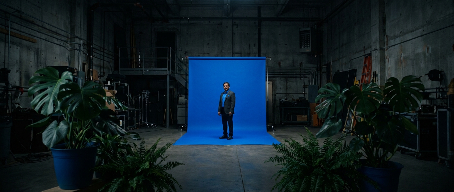
Professional scene illustrating headshot background ideas

The best professional headshot background keeps attention on your face and fits the place where the photo will appear. Neutral gray, off-white, soft beige, muted blue, and a lightly blurred office are the safest choices. Use stronger colors or environmental backgrounds only when they support your role rather than competing with you.

This guide compares 12 practical headshot background ideas for LinkedIn, resumes, company profiles, speaker pages, and personal brands, plus which of those styles belong on a corporate team grid. The examples use the same subject so you can see how the background alone changes the impression.

Professional headshot backgrounds at a glance

BackgroundBest forMain risk
Neutral studio grayMost professions and platformsCan feel formal without warm lighting
Off-whiteClean LinkedIn and resume photosWhite clothing can disappear into it
Soft beige or creamConsultants, coaches, and personal brandsLow contrast with pale clothing
Muted blueFinance, technology, healthcare, and executivesSaturated blue can look like a school portrait
Dark navy or charcoalLeadership, law, finance, and press biosShadows can hide dark hair or clothing
Blurred modern officeFounders, operators, and client-facing rolesA busy office becomes distracting
Warm libraryAcademics, authors, advisors, and speakersShelves and objects can look staged
Soft outdoor blurCreatives, real estate, and approachable brandsBright foliage can pull focus from the face
Botanical greeneryWellness, sustainability, and hospitalityToo much detail looks casual
Industrial loftArchitects, designers, and creative foundersHard textures can overpower the portrait
Subtle brand colorFounders and personal brandsExact brand colors may clash with skin or clothing
White seamlessDirectories, badges, and consistent profile gridsFlat lighting can make the result look clinical

1. Neutral studio gray: the safest professional background

Gray is the most flexible professional headshot background because it works with nearly every skin tone, clothing color, and platform. A medium gray adds enough separation to keep a white shirt visible while staying quieter than a dark backdrop.
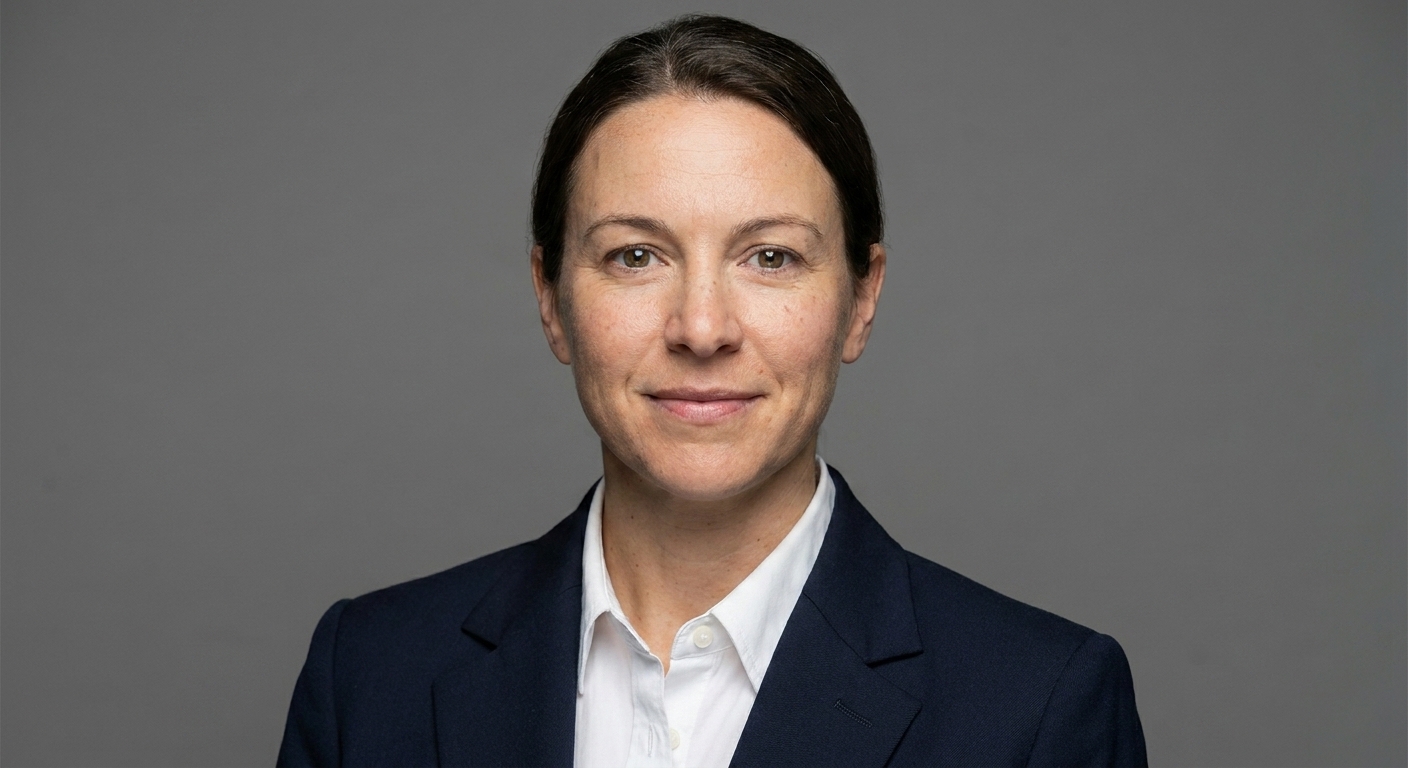
Professional headshot with a neutral studio gray background

Choose gray when the same photo needs to work across LinkedIn, a resume, a company bio, and a conference profile. Add warmth through lighting and expression rather than through the backdrop.

2. Off-white: clean without looking stark

Off-white gives you the clarity of a white background with less risk of looking like an ID photo. It suits recruiters, consultants, healthcare professionals, and anyone whose profile appears on a white website.

Avoid a white shirt under a very light jacket unless there is enough edge contrast around your shoulders. Cream, light blue, charcoal, and navy clothing usually separate well.

3. Soft beige or cream: warmer and more personal

Beige makes a headshot feel approachable while keeping the frame uncluttered. It is especially useful for coaches, therapists, consultants, creators, and independent professionals who want warmth without a lifestyle-photo look.
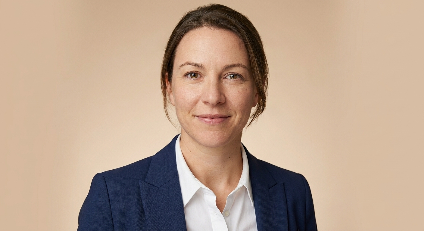
Professional headshot with a soft beige background

The background and clothing should not be the same value. If the backdrop is pale, choose a medium or dark top. If your outfit is light, use a slightly deeper beige.

4. Muted blue: credible with more color

A soft blue background communicates calm and structure without the severity of black or charcoal. It works well for finance, technology, healthcare, education, and executive profiles.
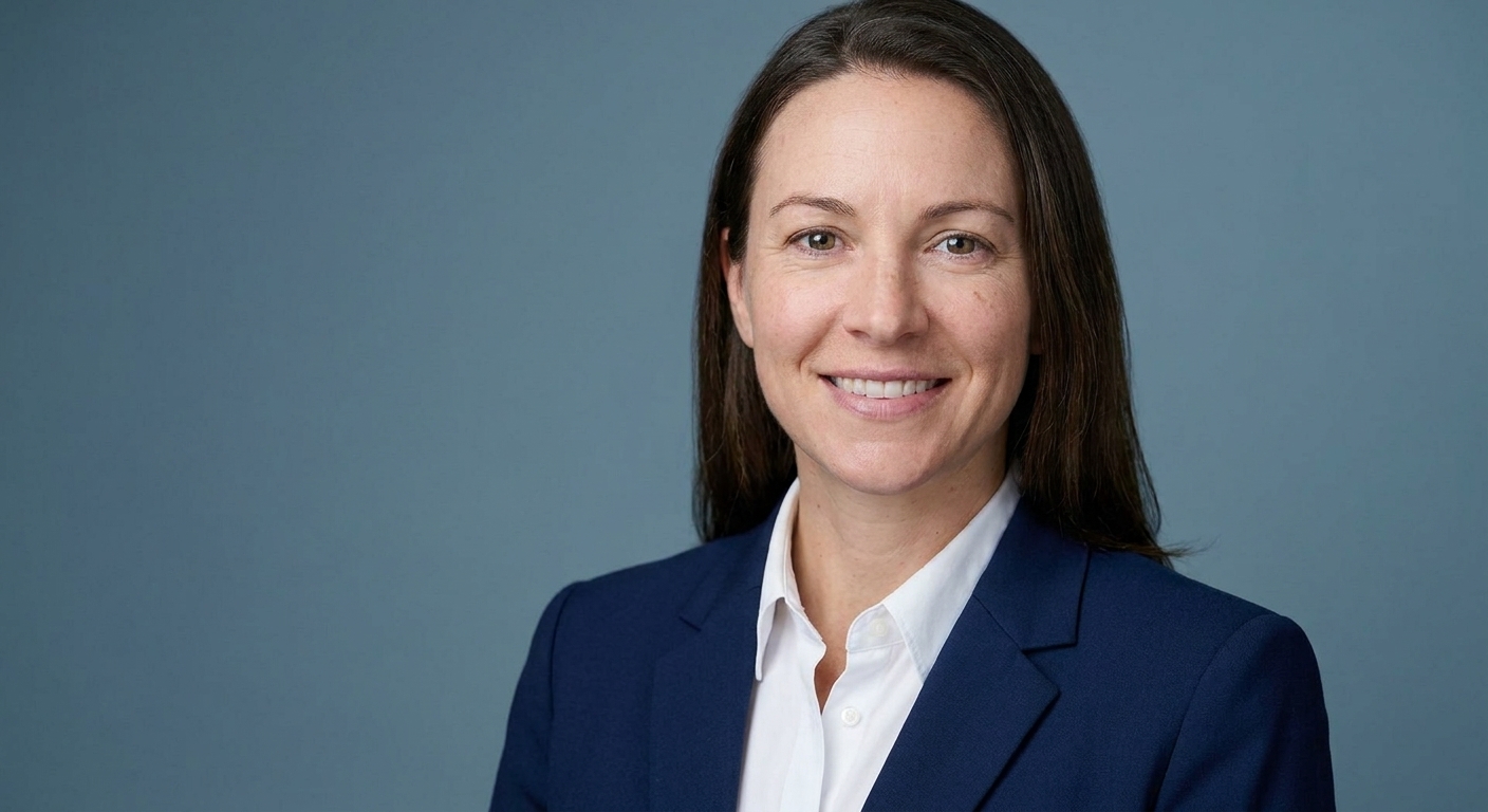
Professional headshot with a muted blue background

Keep the blue muted. Highly saturated cyan or royal blue can compete with skin tones and make the image feel dated.

5. Dark navy or charcoal: polished and authoritative

Dark backgrounds create a more editorial, leadership-oriented portrait. They suit executive bios, legal profiles, finance websites, press pages, and keynote materials.

Separation is essential. Dark hair, a navy jacket, and a charcoal background can merge into one shape unless the portrait uses a rim light or lighter shirt.

6. Blurred modern office: professional context without clutter

An office background tells the viewer where you work while the blur keeps the face dominant. It is a strong choice for founders, operators, recruiters, consultants, and real estate professionals.

Professional headshot with a softly blurred modern office background

Look for large shapes, soft window light, and limited visual noise. Avoid readable screens, prominent logos, and objects that appear to grow out of your head.

7. Warm library: thoughtful and experienced

A softly blurred library can suit authors, academics, advisors, therapists, and speakers. It suggests expertise, but it should feel like a real environment rather than a wall of decorative props.

Use shallow depth of field and a simple crop. If individual book titles dominate at profile-photo size, the background is too sharp.

8. Soft outdoor blur: open and approachable

Outdoor backgrounds work for real estate agents, hospitality professionals, coaches, and creative roles. Choose even shade and a distant background so foliage becomes soft color rather than sharp detail.

Avoid direct midday sun. It creates deep eye shadows and makes both skin and greenery look harsh.

9. Botanical greenery: useful when it supports the role

Greenery can reinforce wellness, sustainability, food, travel, and hospitality positioning. Keep it subtle. One soft layer of leaves is enough; a dense garden scene turns the portrait into an environmental photo.

Create a photo you’re proud to share.

Creating your account is free. Choose a paid pack when you’re ready to create your photos.

Create my account

10. Industrial loft: character for creative fields

Brick, concrete, and metal can work for architects, designers, artists, and startup founders. The texture should stay behind the subject, not compete with facial detail. A neutral outfit and soft light keep the result professional.

11. Subtle brand color: memorable but easy to overdo

A restrained brand-color background can make a founder or creator more recognizable across a website, newsletter, and social profiles. Use a softened tint rather than the most saturated version of the brand color.

Check that the color complements skin tone and clothing. The goal is consistency, not turning every portrait into an advertisement.

12. White seamless: best when consistency matters

Pure white works well for employee directories, ID systems, speaker grids, and marketplaces where every portrait needs the same frame. It is less forgiving for an individual headshot because flat lighting can feel clinical.

If you choose white, keep natural shadow around the face and shoulders so the portrait still has depth.

What works behind a corporate headshot

A corporate headshot has to sit next to other people on a website, in an email signature, and in a slide deck. The background should look like company policy, not a personal mood board.

The styles that survive that grid:

  • Neutral studio gray for most roles. It does not fight a logo, a navy suit, or a white shirt.
  • White seamless when HR wants a matching directory and every new hire has to land on the same field.
  • A lightly blurred office when the company wants "we work here" without showing desks, screens, or a messy plant.
  • Dark navy or charcoal for leadership bios and press pages, only if hair and a dark jacket still separate.
Botanical, industrial loft, sunset outdoor, and a loud brand color belong on a personal brand page. They make one person look like they skipped the team shoot.

Compare those four styles on headshot backgrounds. For LinkedIn crop and file rules, see LinkedIn profile picture.

When the whole team needs the same background

Pick one background and keep it. A gray studio next to a beach sunset reads as two companies. Write the rule down (gray studio, white, or soft office) before anyone generates or books.

Individuals can test gray against office from one selfie in about 60 seconds per image with Portreya, Starter $4.99 for 2 photos, one-time, money-back. See pricing. If you need matching files across many seats, TeamShotsPro starts at $29.99 per seat, 8 photos each, minimum 2 seats.

How to choose your headshot background

  • Start with the destination. LinkedIn and resumes reward clean, simple backgrounds. A company team page needs one shared look. A personal website can carry more character.
  • Choose the impression. Gray and blue feel structured. Beige feels warmer. A blurred office adds context. Dark backgrounds feel more authoritative.
  • Check clothing contrast. Your shoulders should stay visible at thumbnail size. Change the background or outfit if their tones merge.
  • Remove distractions. Logos, text, sharp furniture, bright windows, and strong patterns all compete with your face.
  • Preview the circular crop. LinkedIn crops profile photos to a circle, so keep useful background detail away from the corners. See the LinkedIn headshot size guide for exact crop guidance.
  • Compare two versions. Generate or photograph one neutral option and one contextual option, then view both at small profile size.
Your pose and wardrobe affect the result as much as the backdrop. Pair this guide with the headshot poses guide and what to wear for professional headshots.

AI background or real background?

A real background is useful when the location itself adds credibility, such as a real office, studio, clinic, or property. An AI background is useful when you need several polished options from one selfie or cannot access the right location.

Whichever method you use, inspect edges around hair, glasses, and shoulders. The background should also match the direction and softness of the light on your face. A sharp office behind a softly lit face, or a sunset behind cool indoor lighting, will look artificial.

Common professional headshot background mistakes

  • Choosing a background because it looks impressive instead of because it fits the role.
  • Letting clothing blend into the backdrop.
  • Using heavy blur that creates halos around hair or shoulders.
  • Adding visible logos, text, or fake luxury-office details.
  • Keeping a window or lamp brighter than the face.
  • Cropping so tightly that the background disappears entirely.
  • Using different background styles across professional profiles.

How Portreya fits background selection

Background choice only helps if the photo still looks like you and holds up at small sizes. Portreya is built for that workflow: upload one clear selfie, get polished professional headshots in about 60 seconds per image, and compare background styles before you pick a final image.

With Portreya:

  • Starter $4.99 for 2 photos
  • One-time payment (not a surprise subscription)
  • Money-back if the results are not usable for your profile or resume
  • Best for LinkedIn, job applications, and personal brand pages when you need clean options without a studio booking
Use a neutral gray or off-white option first so your face stays readable in the LinkedIn circle crop. Then try one warmer or role-specific look (soft office, muted blue, soft beige) only if it still contrasts with your clothing. Export the version that looks consistent with the rest of your team or industry, not the one that only looks impressive in isolation.

If you are outfitting a full company grid, teams often standardize backgrounds first, then generate consistent individual photos. Individuals can start on Portreya; multi-seat company rollouts can use TeamShotsPro when HR needs shared standards across many people.

Create and compare your own background options

Start with a neutral gray or soft beige version, then try one background that fits your role. With the Portreya AI headshot generator, you can compare results before choosing the image for LinkedIn, your resume, or your website.

Practical sequence:

  1. Capture one clear selfie in natural light (no heavy filters).
  2. Generate a neutral studio-style set first (gray / off-white).
  3. Generate one secondary set that matches your profession (soft office, muted blue, or warm cream).
  4. View both at thumbnail size. Keep the version where your face stays sharp and clothing still separates from the backdrop.
  5. Download the winner and use the same crop style across LinkedIn, resume, and site.
Starter is $4.99 for 2 photos, one-time, with money-back if results are not usable. That is usually enough to decide between two background directions without booking a studio day.

Frequently Asked Questions

What is the best background for a professional headshot?+

Neutral gray is the safest all-purpose choice. Off-white, soft beige, muted blue, and a lightly blurred office also work well when they fit your profession and provide clear contrast with your clothing.

What background is best for a LinkedIn headshot?+

Use a simple neutral background such as gray, off-white, beige, or muted blue. LinkedIn displays the photo at a small size and crops it to a circle, so subtle backgrounds keep your face readable.

Should a professional headshot have a white background?+

It can, but white is not required. White works well for directories and consistent profile grids. For an individual LinkedIn or personal-brand photo, off-white or light gray often adds more depth while staying clean.

Can I use an office background for a professional headshot?+

Yes. Use a softly blurred office with simple shapes and no readable screens, logos, or clutter. The location should add professional context without becoming the subject.

Should my headshot background match my brand color?+

Only if the color complements your skin tone and clothing. A softened brand tint is usually more professional than a fully saturated brand color.

What are the best backgrounds for corporate headshots?+

Neutral studio gray is the default. White seamless works for a matching directory. A lightly blurred office adds workplace context if desks and screens stay out of focus. Dark navy or charcoal works for leadership bios when hair and a dark jacket still separate. Skip beach, loft, and loud brand color as the company default.

Should everyone on a team use the same headshot background?+

Yes, if the photos sit together on a website or slide. Pick one look (gray, white, or soft office) and keep it for new hires. Mixing a studio gray with a sunset makes the grid look unfinished. A softly blurred office is fine when the whole set uses it and screens stay unreadable.

A few minutesper generated photo

Ready to get started with Portreya?

Creating your account is free. Choose a paid pack when you’re ready to create your photos.

Create my account
Matthieu van Haperen

About the Author

Founder & CEO, Portreya

Matthieu van Haperen runs Portreya, where he helps individuals turn casual selfies into professional AI headshots. Before founding Portreya, he spent 6+ years building and scaling tech startups. He writes about professional photography, personal branding, and how AI is changing online portraits.

Connect on LinkedIn