Headshot backgrounds: 10 styles and when to pick each
The background of a headshot does more work than people realize. The same face on a neutral studio gray reads as recruiter-ready LinkedIn; on a dark executive studio it reads as C-suite board-page; on a warm outdoor blur it reads as approachable real estate agent. Pick the background that matches where the photo will be used.
Every example below is the same person, generated by Portreya, with only the background style changed. Use the gallery to test which context fits your role.

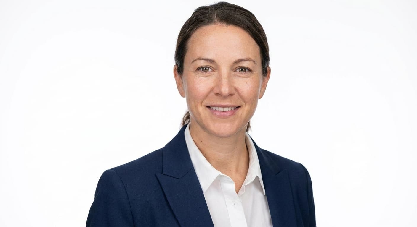
Neutral studio gray
When to pick: The safe LinkedIn default. Reads correctly in both light and dark mode.
Use cases: LinkedIn, recruiter outreach, professional directories.
Portreya preset: LINKEDIN_NEUTRAL_STUDIO
White seamless
When to pick: Classic editorial look. Best for press kits and printed materials.
Use cases: Press kits, book jackets, magazine bios, brand websites.

Modern office (out of focus)
When to pick: Adds professional context without being a posed corporate shot.
Use cases: Company about pages, sales bios, consultant profiles.
Portreya preset: LINKEDIN_MODERN_OFFICE

Executive dark studio
When to pick: Formal, premium, authoritative. The C-suite / board-page look.
Use cases: Annual reports, board profile pages, executive bios, finance.
Portreya preset: EXECUTIVE_DARK_STUDIO
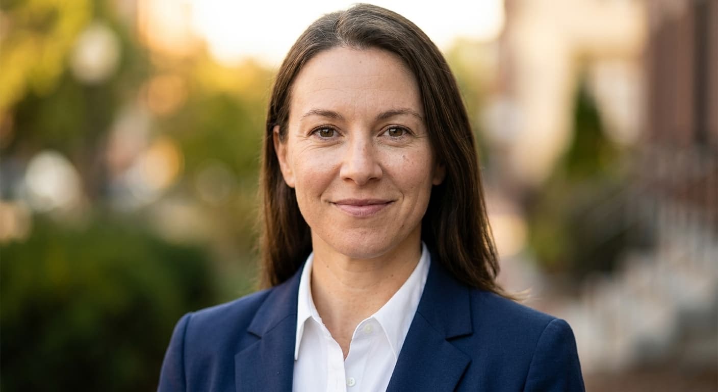
Blurred outdoor (natural light)
When to pick: Approachable, warm, real-world. Works for client-facing roles.
Use cases: Real estate agents, therapists, life coaches, salespeople.
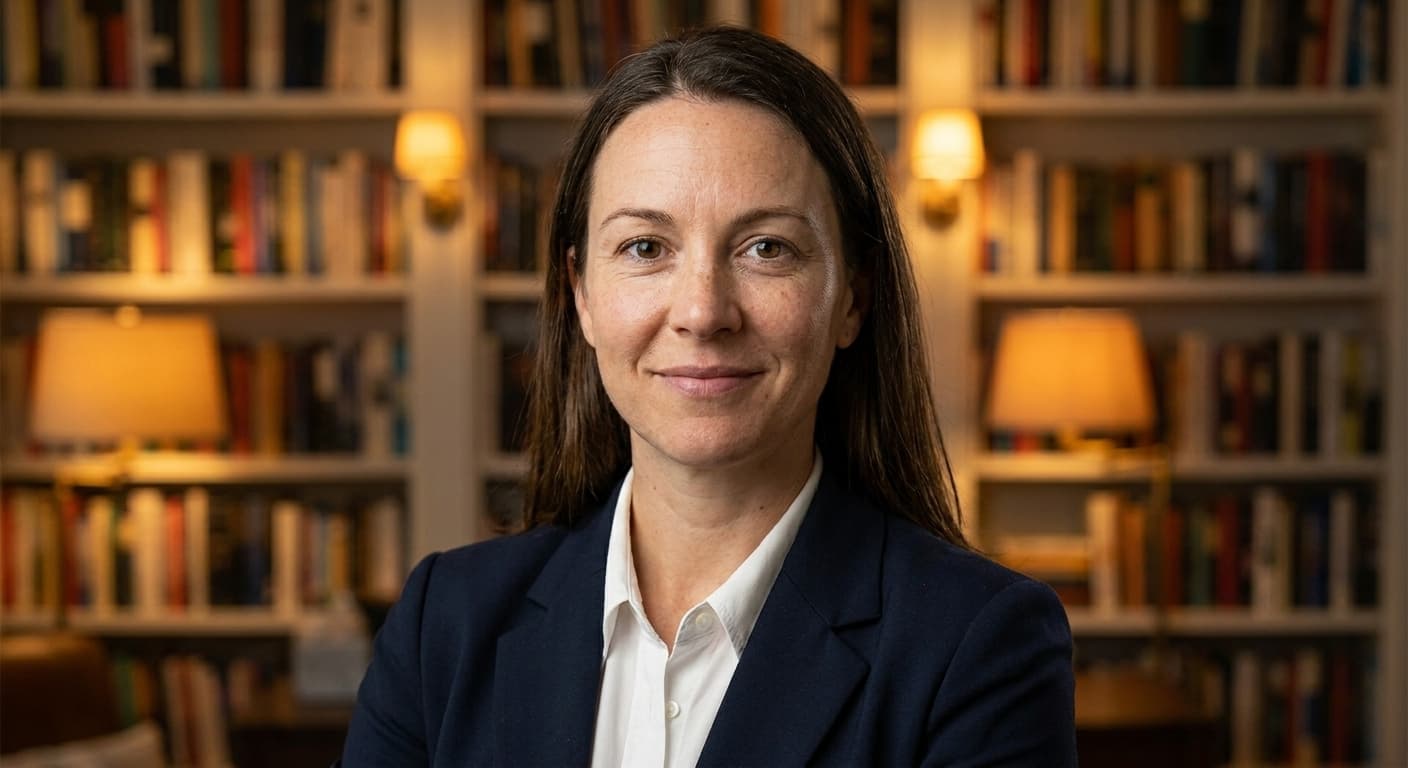
Library / bookshelves (warm)
When to pick: Academic, thoughtful, well-read. Signals expertise and knowledge.
Use cases: Authors, professors, lawyers, financial advisors, consultants.
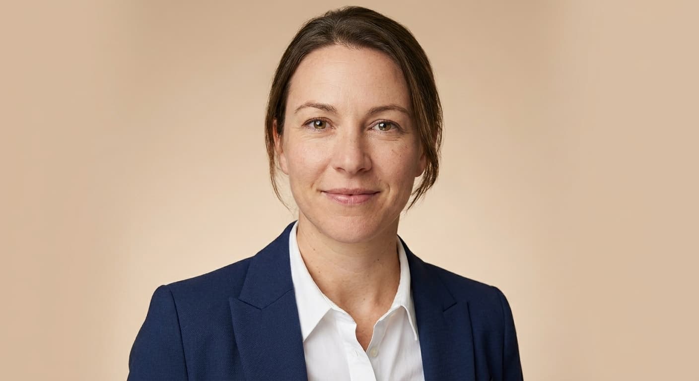
Light beige / cream
When to pick: Warm-professional. Softer than gray, more polished than outdoor.
Use cases: Marketing, design, wellness, coaching, lifestyle brands.

Muted blue
When to pick: Corporate but with personality. Trustworthy without being formal-stuffy.
Use cases: Tech, fintech, SaaS, B2B sales, product management.

Industrial / loft
When to pick: Modern, creative, urban. For roles where personality matters.
Use cases: Designers, architects, creative directors, startup founders.

Botanical / greenery
When to pick: Calm, grounded, wellness-aligned. Avoids the clinical-medical look.
Use cases: Therapists, wellness coaches, sustainability roles, organic brands.
How to choose
Pick by audience and platform, not by personal preference:
- LinkedIn first → neutral studio gray. It reads correctly in both light and dark mode and survives the round-crop test at small avatar sizes.
- Senior / board / formal context → executive dark studio. Conveys authority without being editorial.
- Client-facing trust → blurred outdoor or warm beige. Approachable, real-world, not corporate-stiff.
- Editorial / press / book jacket → white seamless. The classic publication standard.
- Domain expertise signal → library warm. Conveys knowledge and depth.
- Tech / SaaS / B2B sales → muted blue. Corporate trust with personality.
- Creative role → industrial loft. Signals modern and unconventional.
- Wellness / therapy / sustainability → botanical greenery. Calm and grounded, avoids the clinical-medical look.
Common background mistakes
- Pure white background for LinkedIn. Disappears in LinkedIn dark mode. Use a mid-tone gray or muted color instead.
- Busy or branded backgrounds. Logos, posters, or busy patterns pull attention from your face — distracting in feeds where the image is 56 × 56 pixels.
- Outdoor background that's too sharp. Trees, buildings, or background people should be blurred. A sharp background competes with the face.
- Background that contradicts your role. A botanical greenery background for a corporate finance role reads as off-brand. Match the audience's expectations.
- The home-office video-call backdrop. Bookshelves with kid drawings, partial doorways, or random domestic context belong on Zoom, not on LinkedIn.
How Portreya handles backgrounds
When you generate a headshot in Portreya, the preset determines the background style — eight of the ten styles above map directly to a Portreya preset (LINKEDIN_NEUTRAL_STUDIO, EXECUTIVE_DARK_STUDIO, LINKEDIN_MODERN_OFFICE, and so on). The remaining two (white seamless, botanical greenery) come from style modifiers you can apply during generation.
Every Portreya preset is mid-tone-safe by default — even the studio backgrounds avoid pure white. That means your generated headshot will read correctly in both LinkedIn light and dark mode without further adjustment, and survives the 56 × 56 thumbnail crop.
Choose a pack, upload selfies, and use the Portreya AI headshot generator to create your finished headshot against the background that fits your role.
Frequently asked questions
What is the best background color for a professional headshot?▼
Mid-tone gray is the safest universal choice — it reads correctly in both LinkedIn light and dark mode, survives small avatar crops, and matches every professional context. For a more specific role, follow the gallery above: executive dark studio for senior corporate, warm beige for client-facing, library warm for academic.
Should the background be blurred or solid?▼
Both work depending on context. Solid neutral backgrounds (gray, beige, dark studio) suit LinkedIn and formal corporate. Blurred backgrounds (outdoor, office, industrial) add real-world context but must be soft enough not to compete with your face — a sharp background reads as a snapshot, not a professional headshot.
Why does my LinkedIn headshot look bad in dark mode?▼
Probably because the background is too close to pure white. White backgrounds disappear into LinkedIn's dark theme, leaving just a floating face. Use a mid-tone gray, muted blue, or warm beige — every Portreya preset defaults to a mid-tone-safe background for exactly this reason.
Can I change the background after generating with Portreya?▼
Yes — choose a different preset before generation to get a different background style on the same face. You don't need image-editing software; the background is part of the preset, not a post-edit step.
What background should a real estate agent use?▼
Blurred outdoor or warm beige reads as approachable and trustworthy — the qualities clients look for when picking an agent. Avoid dark studio (too corporate-cold for residential real estate) and pure white (too clinical). The blurred outdoor preset is the most common pick for agent photos on Zillow and MLS listings.
Try the background that fits your role
Choose a pack, upload selfies, and switch presets to test different backgrounds in seconds.
Create your free account